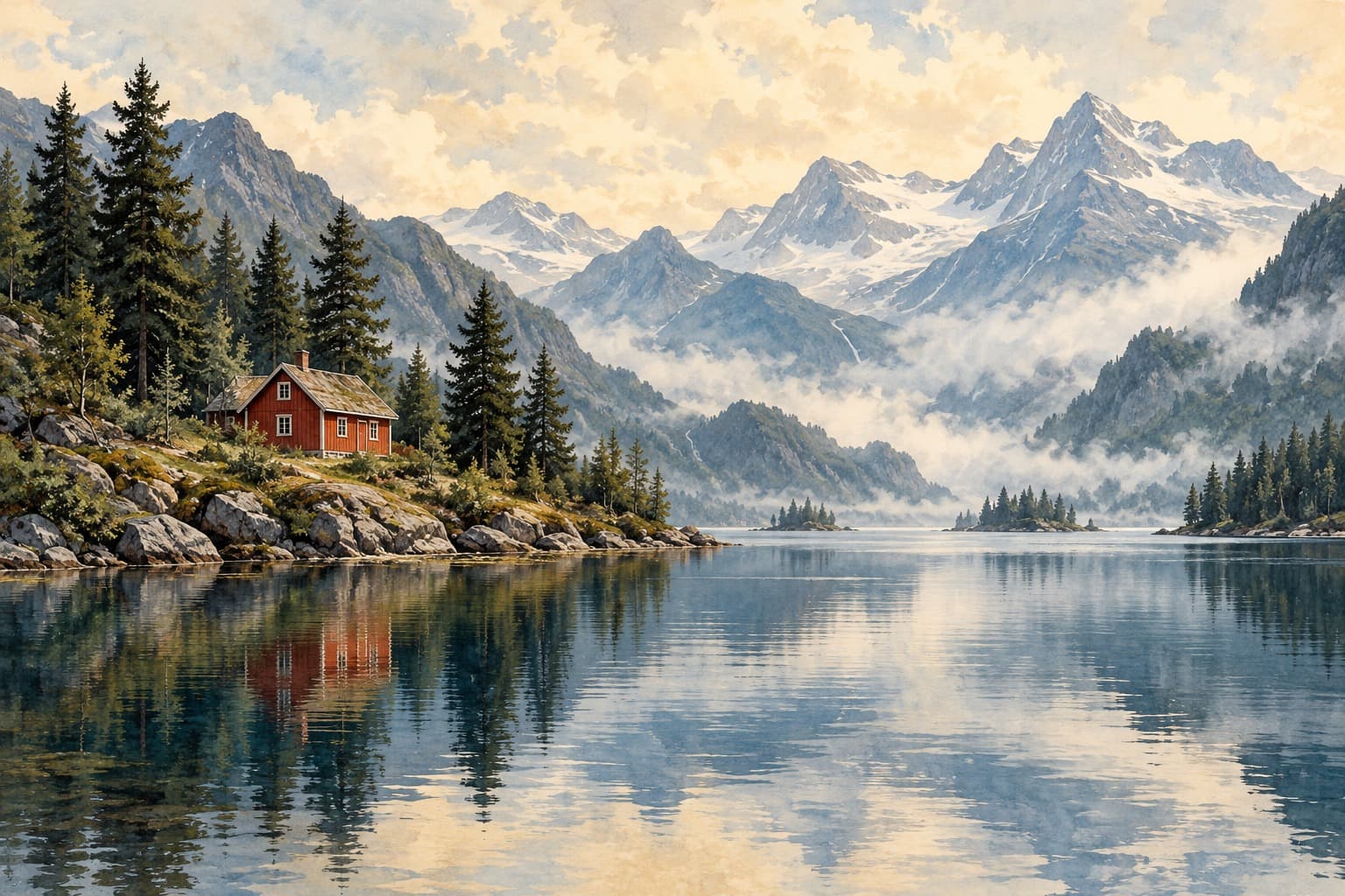
Red Cabin, Quiet Water
Watercolor-like digital artwork · Landscape
Loading saved cart.
Compare how much blue is visible, how light or dark it is, and whether it appears in sky, water, or another part of the image. Blue describes the artwork’s palette, not the color of its frame.
Watercolor-like digital artwork · Landscape
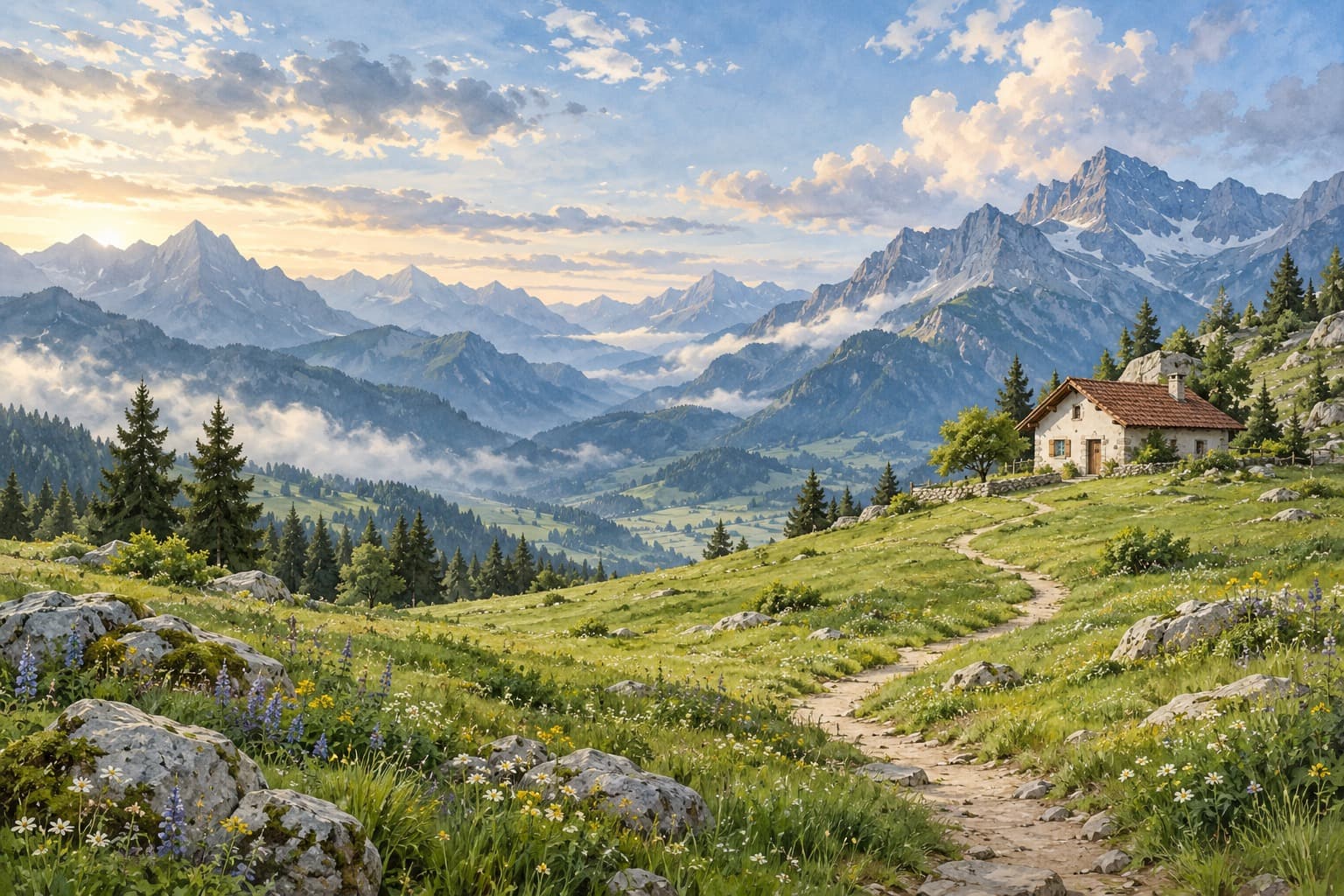
Watercolor-like digital artwork · Landscape
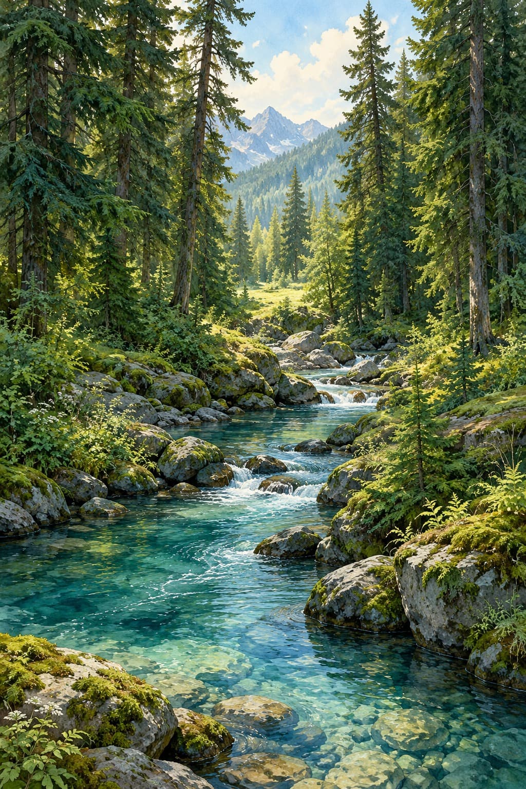
Watercolor-like digital artwork · Portrait
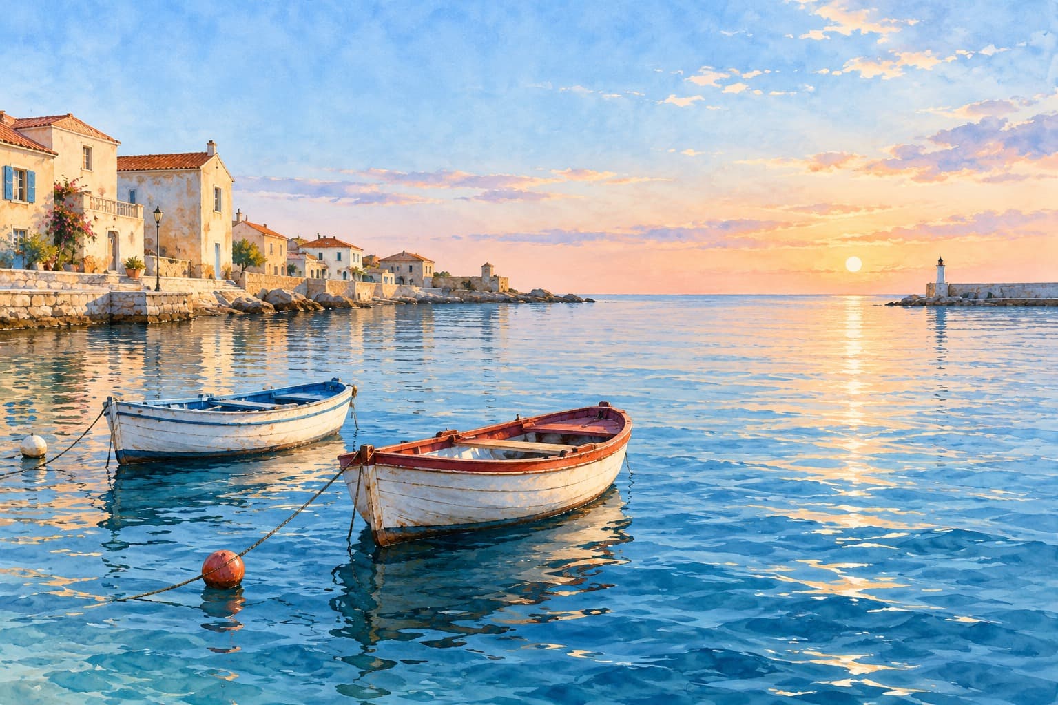
Watercolor-like digital artwork · Landscape
A blue textile or painted detail can provide a starting connection. You do not need identical shades throughout the room: compare the image against the wall, furniture, and one nearby material to decide whether you prefer repetition or contrast.
View your room in daylight and with the lamps you usually use. Then compare the actual frame options against both the image and wall. Screen settings affect perceived color, so a screen comparison is a planning tool rather than a physical color proof.
Choose a dominant color, repeat a small accent, compare warm and cool finishes, and test blue-green artwork against the light and materials in your room.
Compare canvas, framed canvas, framed paper prints, and unframed art prints by their edges, materials, size choices, and the details to check before buying.
Art for the spaces
you call your own.